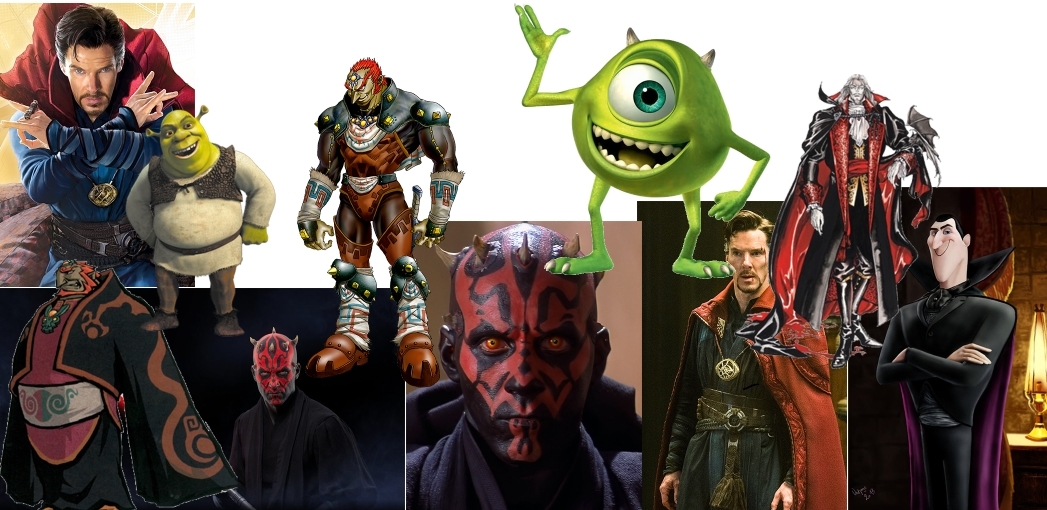
For my week 1 work, I had to design a character and draw them using Adobe Photoshop. I didn’t plan this design out much initially however I had an idea in my head and some characters who I clearly based this design on. I have made a quick moodboard that shows some of the inspirations for this character design.
For this moodboard, I have included many characters which I had in my head when initially designing this character. Mike Wazowski from Monsters Inc. and the many different interpretations of Bram Stoker’s Dracula such as the Castlevania and Hotel Transylvania versions are the most obvious influences in my opinion. I focused a lot on a black and red colour scheme for the character’s clothes which can be seen through characters like Darth Maul from Star Wars, the aforementioned Dracula and Ganondorf from The Legend of Zelda. For the face I went with a green colour scheme, with clear influence from Mike Wazowski as well as the cyclops from Greek mythology. Some other charaters I included in this moodboard were Shrek, who was a character I initially had in my mind when drawing the character’s head, and Dr. Strange who’s influence comes through in the medallion that my character is wearing.
The image below shows the character that I have designed.
The drawing here is very simple and not particularly well drawn, however it is to be expected as I was very inexperienced with art when I drew it. I would like to revisit this character in the future when my drawing skills have improved. I started off by drawing the head which I shaped like an oval. While my initial thought was to draw an ogre type character with more of a Shrek influence, I ended up drawing a character who looked more like Mike Wazowski instead. I included a small white spot on the character’s head to make it look like there was some light being reflected. I also drew horns, fangs and a monobrow to make the character look more intimidating. I ended up drawing one large eye as I experimented with giving the character two eyes and it didn’t look as good. For the character’s clothes, I decided to give him a cloak. I did this to cut some corners as I couldn’t draw hands at the time and while I have improved since then, it is still one of my weakest areas. I used a black and red as inspired by Dracula, Ganondorf and Darth Maul. The design for the cloak was inspired by Ganondorf from The Legend of Zelda: The Wind Waker and Dracula from Castlevania: Symphony of the Night. I added a Doctor Strange inspired medallion to the character design to add a bit more flair to it. I decided to name the character Keith as I enjoy giving generic names to strange characters.
For my week 2 work, I had to create an image that made use of photo manipulation. For my initial design, I wanted to overpaint an image, however due to problems I had with photoshop at the time, I decided to simply edit an image instead.
In this image, I used two stock photos the first was a stock image of a man in a costume of Toad from Super Mario from unsplash. This is the link: https://unsplash.com/photos/lwuOwEhbDfE
The second image that I included is a stock image of Mt. Everest which I also got from unsplash. This is the link: https://unsplash.com/photos/CoE79_lhTJM
When editing this image, I wanted to make it so that Toad was towering over Mount Everest, so I used the eraser tool and erased the background, as well as removing toad’s lower body. After this I used the blur tool to smooth out the edges which is useful as it hides some of the shortcomings in my photoshop skill. This image is very basic as it was my first time using photoshop, however I would like to work in improving it in the future and using some more tools.
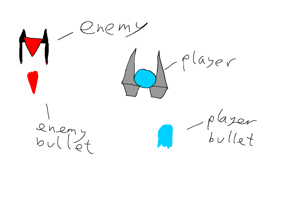
For my week 3 task I had to design assets for my Space Invader clone using shape and colour theory.
I wanted the enemy ship to come off as more harsh so I used more pointed shapes to represend this. The centre part of the ship is a triangle, as is the bullet and there are two triangles on the back of the ship as well. I made the blasters on the front long and narrow. For the player ship I used a circle as the base for a softer tone, however I still added some pointed shapes for the blasters. I also rounded out the bullet to make it appear softer. I wanted to use two contrasting colours for the different ships so I made the enemy ship red to represent anger while I made the player ship blue to represent compassion.
After making these assets, I redesigned them in a pixel art style because I wasn’t very happy with the way the initial designs looked.
The image above is my ship art. I ignored the shape theory that I used in my previous drawings however I kept to the red/blue contrasting colour scheme in both. The shape for this one is more angular than the previous one, however I’m a lot happier with the way this one looks. This is the player bullet. I roughly kept to the same design for it however I added more detail through shading. I kept to the blue colour scheme and the rounded shape as I found both of these to work well.This is a redesign I did for my enemy ship design. I redesigned it to look like a bird instead as it is more unique than just having another spaceship. I kept to the red colour scheme however I went with a much darker red this time. I think that I could improve this drawing later on by including shading. This is the enemy bullet. As much as I would like to go into detail about it, I simply flipped the player bullet and changed the colour to red. Despite that it does what it needs to do quite effectively.
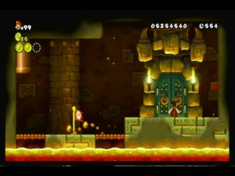
For my week 4 work, I had to a one point perspective drawing. For this I started to look to some games that I am interested in for some influence. I started to look into New Super Mario Bros Wii for the Nintendo Wii (obviously) and decided to try and draw something inspired by the entrance to the Bowser fight, however done in one point perspective instead of 2D like the original.
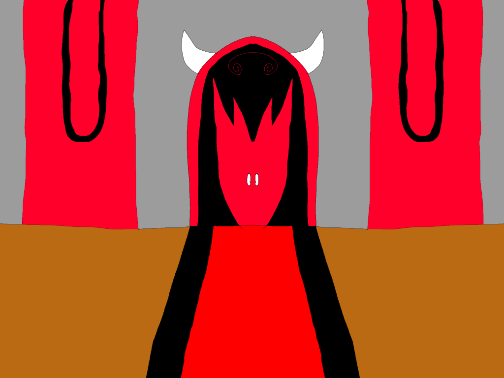
This is what the door looks like, I will be changing up the colour scheme slightlyThis is what I ended up drawing. I didn’t do any shading as I had zero knowledge of shading at the time when I made this. I decided to use a similar black and red colour scheme to my initial character design. I chose to make the floor brown to represent that it is made out of wood and I included a black and red carpet in the centre leading towards the door. I included two identical banners on each side of the room and then drew the door itself. I added a simple black and red pattern on the door slightly inspired by the pattern that I added to the cloak of the character that I drew earlier on. I then also decided to add horns to the door, similar to the horns that were on my character. To help illustrate that the door is the main focus of the image, I decided to make the carpet get thinner as it gets closer to the door. This creates a feeling of depth. In conclusion however, I am not happy with the way that this turns out and would like to revisit it when my art skills have improved in the future.
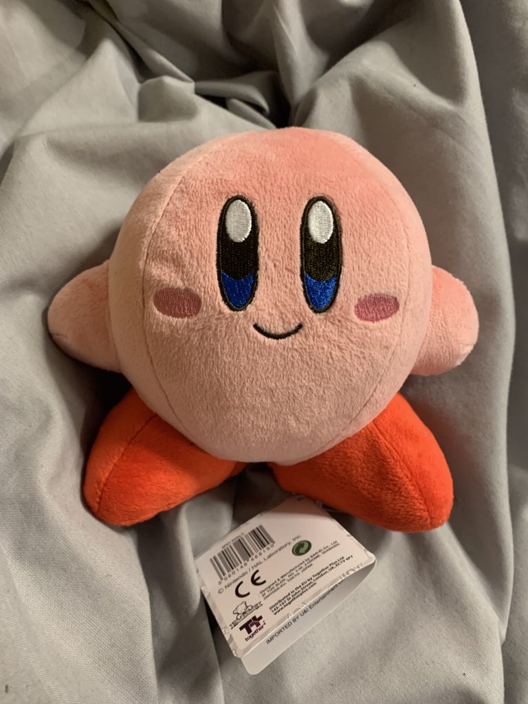
For my week 5 work I had to do some shading practice. I had recently been given a plush of Kirby by a friend so I decided to draw this plush to practice cell shading. I have attached an image of the plush below as a reference.
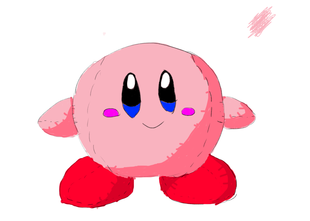
This is the drawing that I came up with based on the plush. This is the first image that I have drawn that I was actually somewhat happy with the outcome as while it isn’t anything amazing, it is a vast improvement. I started off by outlining Kirby’s body as well as his arms and legs. This was quite easy as he is made up of many basic shapes. I closely followed the dimensions of the plush as a reference for parts such as the distance between the eyes and the mouth. After I was done with the outline, I began colouring in. I began by doing a flat colour layer where I coloured in the main body. After this I selected a shadow using a slightly darker shade of pink. I used the same colours for both the body and arms, however I used red instead for the shoes. I am very happy with the way the shading went on the left shoe. After I was done with this I added the eyes and blush on the cheeks. For these I simply used flat colour, carefully referencing the colours on the plush. Finally I finished it off by adding stitch marks to make it clear that the drawing is meant to be a plush.
For my week 6 work, I had to draw pixel art. For this I drew two things, the first was for my cookie clicker clone so for this, I decided that I wanted to make pixel art of a box of chips. This is inspired by the weatherspoons chip count facebook group where people try to collect one chip from every weatherspoons in the country.
This is what I came up with. I started off by looking at some references and decided that I wanted to follow the design of the McDonald’s chip boxes which I have included in an image below. I started off by making the box. For this I decided to make it a rough cylinder shape i made it tilt up slightly more at the top as it gives it more of a cylindrical appearance. I coloured it in red and tried to include some basic shading in a slightly darker red colour, After this I started working on the chips. For these I mostly just placed random black pixels chaotically while still trying to follow the long shape of chips as that is what they are like in the box. I then coloured them in yellow and did some shading in a darker yellow. Overall I am quite happy with how this turned out as it is very obvious what it is supposed to be.
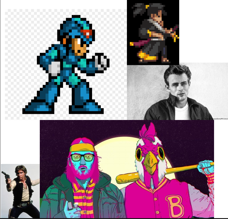
After that I decided to make a pixel art character. I started off by looking at influences.
Here is a small moodboard I made with some influences for my character. The Han Solo influence is incredibly obvious in the colour of my jacket. I also looked at some of my favourite pixel art games such as Mega Man X and Katana Zero for inspiration. Here is the character design that I came up with. I am somewhat happy with the design however I believe that it would be a lot better if I added some more shading as I only shaded the jeans. The design was primarily inspired by Han Solo and James Dean however I changed it up slightly by adding a different hair colour. I curved the character’s arm and made him put it on his waist to give it a bit more personality. I decided to go for a darker colour scheme with this piece to show that he is from a rough area. I am not very happy with the way the face looks as I think the eyes could look a lot better.
For my week 8 work, I had to create a walking animation. For this I used the photoshop timeline feature.
This is the walking animation that I created. I’ve never animated anything before so I used stickmen to simplify it. After each frame I bend one of the character’s legs to show that their leg is being lifted.
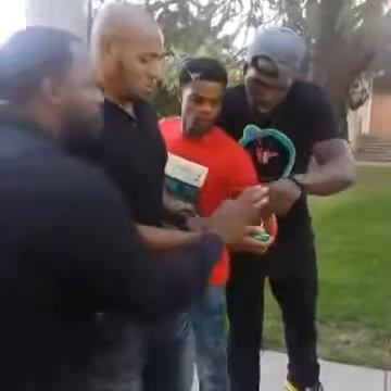
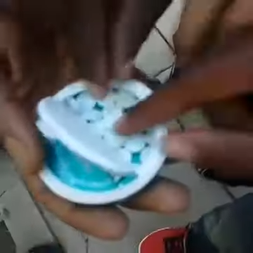
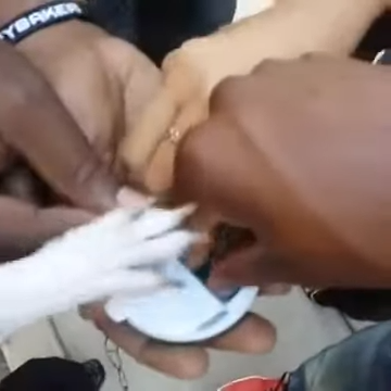
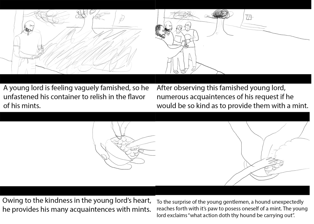
For my week 9 work, I had to create a storyboard. For this I was inspired by the “what the dog doin'” vine by King Bach I have included a link below:
I started off by finding four frames from the video to recreate in my story board. The first of these is the opening frame
The second is the frame below:
The third is the frame below:
And finally the fourth is the frame below:
Here is the full storyboard that I designed. It is quite simple, however it gets the story across somewhat effectively. In the first frame, I draw the first man holding a pack of mints. I draw a tree and a small house in the background for a bit of extra detail. In the second frame, I draw the other three men coming up to ask the first man for mints. The same details are still there in the background. In the third frame, I drew a closeup of the box of mints with three hands reaching for it. This is where one of the biggest flaws in my storyboard is as I am not great at drawing hands. In the fourth image, I added the dogs paw reaching for the mint. In the text below each image, I explain the storyline behind the image.
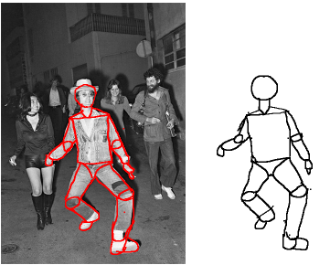
For my week 10 work, I needed to analyse the anatomy of a human, for this I have analysed the anatomy of a famous image of John Lennon from The Beatles.
Here is my attempt at analysing anatomy. I started off by looking at different parts of John Lennon’s body and analysing the shapes. I drew a circle to represent his head first and went down from there. I drew a rectangle to represent his chest and then moved onto the arms and legs. For these I needed to pick out the joints where his limbs bend and I represented these with circles. After this I used long cylinders and rectangles to represent the lengths of John Lennon’s arms. I am quite happy with how this analysis turned out as I created a somewhat accurate interpretation of the anatomy in the image.
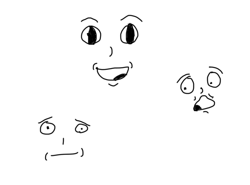
For my week 11 work, I needed to draw some facial expressions.
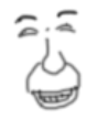
These were the three that I drew. The first is meant to represent happiness. I made the eyes wide to show excitement and made the mouth large and slanted. I added lines to show wrinkles around the mouth. For the second, I drew a shocked face. I drew the eyes slightly off center to represent that the face is looking at something. I drew the eyebrows slightly slanted to show that the character is distressed. I then drew lines around the character’s mouth to show wrinkles. For my third face, I drew an uncomfortable face. I drew the eyebrows tilted up to show distress and then made the eyes small. I drew wrinkles on each side of the mouth. I am not particularly happy with how these turned out and would like to revisit this topic in the future.This is another example of a face I tried to draw in a more realistic style, however I am unhappy with the way this one turned out.